Friday, 30 April 2010

pastel landscape painting - a failure

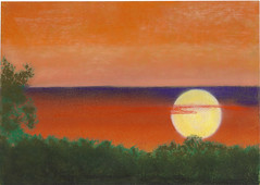
I did originally say that this blog was about the trials and tribulations I encountere in my art work. I do show a few failures but generally try to keep the real no-nos to myself. This was a special case. I had selected a reference to paint because it had such a wonderfully coloured sky. I spent the best part of my art group meeting this past week layering several colours into the sky

after the storm

before adding a distant line of hills and the yellow on red middle distance. The final touch would have been the dark ( black) foreground and the trees and foliage, bringing the foreground and the sky together. But before I got to that last part, I began to have doubts about the sky. I do wish that I had taken a photo of it to illustrate the point, but it looked ( not to put too fine a point on it) rubbish.

Now I have to admit that I use fixative .....shock, horror... I build up my pastels with several layers of colours often stating with a contrasting or even complementary colour. The first layers are fixed and then The top layers can be left fresh, and there is little danger of mixing the colours as the later pastels are added - no smudging. You can see an example of this in the yellow on red middle ground. I developed this technique from painting pastel abstact paintings where the possible texture/granulation was a large part of my style. BTW my fixative of choice is the cheapest hair-spray I can find in the local supermarket.

In this case, it may just have added a bonus. Because the innitial result was so awful, I decided to use a kitchen tissue to rub off all the sky and start again. The fixative does stop accidental smudging but cannot cope with a determined effort. Of course the board was stained with the colours and the rubbing provided a high degree of mixing. BUT I was amazed, not what I had set out to do however there was a very useful looking sky. I added the purple clouds, keeping them low key, and was very pleased with the outcome. A happy accident you could say. I then finished off the foreground and showed the piece to my colleagues who seemed to agree with me.

the painting is approximately 14x10 inches

I hope you find it to your liking and would love to hear your comments. Just shows that sometimes a little luck is all it takes. Thanks for looking.

Wednesday, 28 April 2010

Artistic Alphas challenge- April

Finding lots of inspiration on Kim Newberg's PDA. The Artistic Alphas group is about creating art with a running theme of "the alphabet". It has only recently got underway and with April we have reached "H" and "I". For this I wanted to do something a little different to my usual ATC, so decided on a tag for one of the pieces and only one ATC for the other.

H is for.... Horse
Tag: H is for ..... horse

I took an ordinary parcel tag and layered it with a dark brown craft paper, wrapping this around the edges of the tag for neatness. I then layered a complimentary coloured craft paper on the back ( no photo) to leave a couple of mm of the brown showing around the edge. I then qadded the image of the girl and the horse, and a border at the bottom. I embossed a card bookplate and added this to the tag, and added what I thought would be suitable text. The "H" and the threads were added to complete the piece.

ATC: I for musical Instument ( alt: It Takes Two)
ATC: I is for ...... musical instrument

Fell back into an atc for this second piece, I found (?) this image on a collage sheet from Kim Newberg and decided to use it for this atc. It was a very simple image in B&W so I decided to create a slightly more complex background using several craft papers / downloaded images. Again the "I" is because it is one of the Artistic Alphas entries.

As usual, larger images may be seen on my Flickr photostream, thanks for looking.

Saturday, 24 April 2010

Pink ATC's for PDA

Gosh ( or words to that effect), I feel like I am on a roll with my output this week. Actually, I had a couple of days of work. Being MIL's 99th birthday, we took her out for the day as I mentioned in a previous post. Lovely weather, by the way! I had such a lot to do around the house that instead of the one day I had planned to take off work I decided, "what the heck? why not have three days off! It has certainly helped with my to-do list and also allowed me a few free evenings to catch up on some challenges I like to do.

These are for a challenge on PDA known as Pocket Packet Friday. Originally Kim sent the winner of the challenge a pocketful of ephemera for use in art/craftwork. My first pocket was cut from a pair of denim jeans. The beauty of this challenge is that it is not retricted to a particular format, as long as the work complies with the current theme the artist can submit anything at all. Any conceptual artists out in there with time on their hands, looking for a challenge?

Anyway, I have entered two atc's for this weeks challenge with a theme of PINK. Full credits for the images are given on my Flickr photostream. Here are the photos:-

the "wink" said it all
the wink said it all

oohhh! Is that for me?
ooohhh! is that for me?

thanks again for looking, hope to have more "stuff" for publication soon.

Friday, 23 April 2010

more atc's just to prove I am still doing them

Ok, not too many atc's recently but am just catching up on a couple of swaps with these.

ATC; something fishy

The first is called, "something fishy". created for a swap on the Flickr group, "artful ideas" with a theme of under the sea. The background is a layered tissue paper to give a feeling of the sea bed / waves ( underneath the sea?) and I have added images of fish from a collage sheet by Kim Newberg and seaweed cut from an image from a gardening mag. They were garden plants but serve my purpose here - you wouldn't know would you? The smaller fish are swimming in and out of the weeds.

ATC; who's a pretty boy then?

I made this for a swap on PDA with a theme of "floral". I call it, " who's a pretty boy then". My grandfather used to breed budgies and when I was a nipper, we had a succession of budgies as pets. Of course they all had mirror's in their cages and would be taught to repeat the phrase, "who's a pretty boy then". And yes I know these birds are not budgies, LOL. The sunflower image is actually cut from a greeting card sent with a previous swap ( sorry forgotten who sent it to me) and the mirror with the wire frame seemed to fit so perfectly. Had to resort to a hot glue gun to fix it down tho. Browsing thru my stash, flowers were significantly absent but seemed to be lots of birds, so they were made use of. Thanks to Jean Roman for the felt flower. The button was an afterthought to add a little contrast/balance. Larger images can be seen on my Flickr photostream

Thanks for looking, more to come soon.

Wednesday, 21 April 2010

Little Row House bonanza

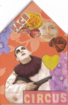
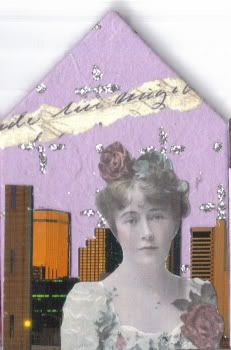
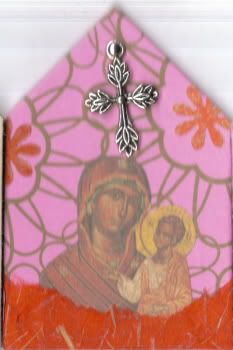
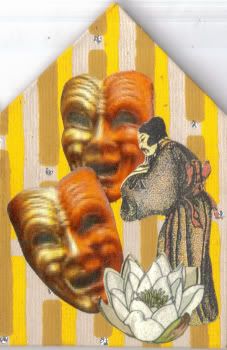
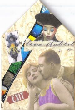
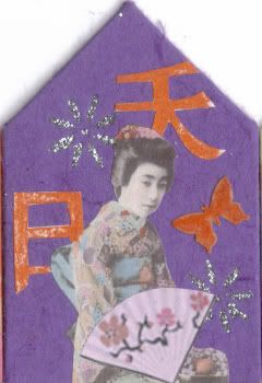
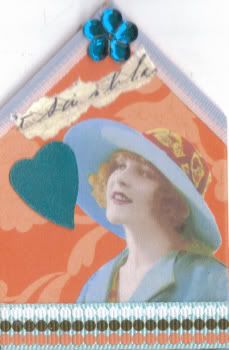
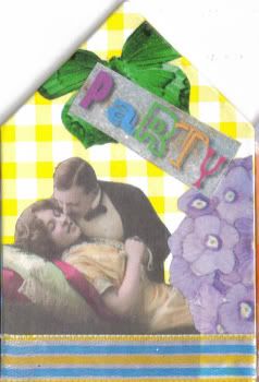
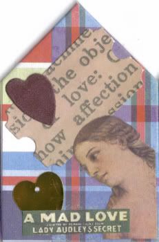
The latest challenge in the Row House group on PDA ( paper digital art and images by Kim) was to complete at least one set of ten ( yes ten) row houses on "proformers" sent out by Kim. The theme was, " in a colourful neighbourhood".

Got mine late thanks to the Post Office, well all the US based members seemed to receive theirs well before the UK based members. And then force majeur seemed to prevent me from early completion of my entries. I was installing a new kitchen (still got a long way to go!) birthdays ( my DW and MIL who is now 99 years old) and the first bit of sun in ages meant that the garden needed tidying, at least my wife thouht so. But have finally got them in the post when the airlines in the UK and most of northern europe were grounded by this blastedIcelandic volcano, flights have now resumed but delays will have caused huge backlogs for commercial organisations as well as holiday makers.

Anyway, here they are; BTW these images are 96dpi and have been copied from 300 dpi scanned images on my flickr photostream. I know the screen resolution is the former but they look so much better on Flickr.


Photobucket
"He saw her face everywhere"


Photobucket
"The morning after the night before"


Photobucket
"Peace"


Photobucket
"The Master"


Photobucket
"Warning Signs"


Photobucket
" Madame Butterfly"


Photobucket
"The Optimist"


Photobucket
"Party"


Photobucket
"Love"


Photobucket
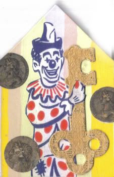
" The Key To Happiness"

-a little money and a great sense of humour!

they are all simple collages and the houses are 2 inch ( 50 mm) wide, so a little smaller than an atc. I have used a pastel pencil to touch up small areas of colour where I needed to match elements and I painted the key, above, with a watery acrylic gold paint to allow the text to show thru.

Here's hoping they are not delayed for too long or worse yet lost in the ether ( aka PO wharehouseing system). Thanks for looking.


Friday, 16 April 2010

A new pastel painting - african sunset

Wow, another post already; things may be looking up. On the other habd I did not want to leave the decorated egg as my top post, LOL. this is a piece i did at my weekly art group last Tuesday. I am still concentrating on pastel and particularly on limited palette works. This was one of the african sunset atc's ( watercolour) which you may remember I did recently. I have enlarged the format, this is now an A4 painting and used a very much stonger colour set. One of the things I love about pastel is the quality of the colours it is possible to achieve. I think this can be misinterpreted as I have used such a luscious purple for the cloud top. It looks like an horizon and even could be seen as the sea but it is definitely not either and the setting sun should give the clue here. The source image for this painting did show the sun as an almost complete circle broken only by the foliage. I am not a meteorologist so cannot explain why the sun appears to be in front of the cloud bank. Anyway I am very pleased with the piece if I do not stop to try and explain it all.

It is simply an image of the sky as the sun sets seen over a drift of trees. The trees were painted firstly in the lighter green seen at the top level and then overlayed with a dark olive green and lastly with black to get the right depth of colour.


african sunset
A larger image can be seen on my Flickr photostream. Well that feels better, hope you like it and thanks for looking.

Thursday, 15 April 2010

decorated egg - way out of my comfort zone

A decorated Egg; OK I admit it, this was one challenge on the PDA site, that I had intended to let pass by. Not my cup of tea at all!

However, on a shopping trip with my DW, I was looking around a garden centre with a craft section and found this polystyrene egg. I decided that I couldn't let the opportunity pass and purchased one of them ( about twice the size of a chickens' egg) and set about decorating it.

I skewered it so that I had something to hold on to and began by painting it with a gold acrylic paint. before it was dry I poured some silver sparkle on to a scrap of paper and rolled the egg in it to get a good and overall covering. After it had dried the glitter was quite loose so I sprayed it with the sealer I use for my pastel artwork. A good coating to make sure that no bits of glitter came off and gave me a firm surface to start to work with.


a decorated egg........

The heart shape was a tiepin/badge for the British Heart Foundation which I had recently purchased ( yes I bought it!) and decided that it needed more of the same to stop it looking so lonely. I had some faux gems of various colours and they were just the job. The red ribbon was something I had just purchased of Kim Newberg using PDA points which I had won on the Paper & Digital Arts web site run by Kim for taking part in various challenges amongst other things.

Anyway the ribbon looked a little bare so I finished it off with a length of gold braid which I had had around in my stash for some little while. I put the resulting egg in amongst a vase of chrysanthemums, and took this photo - it seemed to fit quite well.

Actually although a new community site ( on the NING network) there are lots of different craft based challenges going on and you may find something to interest you. Why not pop over to PDA and give it a go.

- thanks for looking in, see you again soon.

Sunday, 4 April 2010

altered jigsaw pieces

Herre I am again apologising for my tardiness. I have really been so busy installing a new kitchen and my art/craft work is having to take second place. I thought for this post I would show some altered jigsaw pieces that I have been playing around with. They both have interesting background ( for me!) and are worth making a note of. I shall probably use the techniques again.

Twitterpatted

Created for a group challenge on PDA, The background was created from a crumpled chocolate wrapping, and the rest was simple collage. The only probalem was in getting the paper images to stick to the gold foil. As it was crumpled, there was not a lot of area for the glue to hold to. I had to use an acrylic sealer and then gave the whole surface a coat to finish it off. This image does not show the final coating/sealer. Twitterpatted is a word from a disney cartoon film, I think. I found it on a list of words for use on collages, and it seemed to fit in perfectly with the image of the owl. The raven was a second thought to balance the flowers at the bottom of the piece.

altered jigsaw; blue mood

This was for a challenge which I never managed to enter; too late!!! the theme was monochrome. I decided on blue as I rather liked the image of the lady from a series of bookmarks on a collage sheet from Kim Newberg. The background was done in two stages. A black tissue paper was layered to the piece to cover the image and this was covered by an open weave blue cloth, almost like fibre-glass I used to use to repair my old bangers when I was younger.

Larger copies of these images are available on my Flickr photostream, if you are interested.

Ok, thanks for your patience but I am now going back to the kitchen cupboards - what a way to spend a lovely sunny bank holiday sunday!

Additional information: The Twitterpatted piece is about 4.5 inches high. The Blue one is 6.5 inches.The first is actually a "double piece" and the second a Floor Puzzle. They are both quite thick childrens' puzzles. Although it is possible to alter much smaller pieces. they do provide creative issues that are not normally a problem on rectangular formats.