Sunday 22 February 2009

Sketching before collaging?

Hi again

I have a question for all you mixed media artists reading this blog. As a watercolourist ( primarily ) I will usually do several small, thumbnail sketches before I start on a full size painting. I have not done much painting lately, as you will know if you have been following my progress. However, because I enjoy sketching, I often use a sketch before collaging especially if I am working to a theme, etc for a challenge. If I have been inspired by an image then this is often an unnecessary step and does not lead to a sketch. But working to a sometimes obscure (?) theme, I find it very helpful to clarify ideas for images to select.


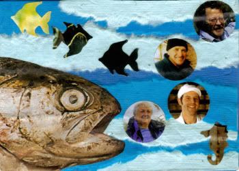
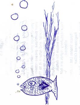
This is one time when I should have gone with the flow. I was doing an ATC for the Paper Digital Art and ImagesbyKim site on the theme of "Circles". I had one or two ideas off the top of my head but decided that my circles would be bubbles.... coming from the mouth of a fish! I very briefly sketched out an idea, using images of (fisher)men in the bubbles. I had a picture of a fish which I had cut out of a magazine and added to my collection of such things - rubbish my OH calls them - and decided that to add a little interest some seaweed would be just the job:-


Photobucket

You can see the text on the reverse of the paper showing thro' here, infact it almost adds a little texture, perhaps if I had added some more contrast to the scanned image? Anyway, I thought that this would be the way forward. BUT when push came to shove, I actually veered away from this sketch and came up with this:-

Photobucket


I don't know why but the seaweed had morphed into a number of die-cut "fishy" shapes. The sea was implied by using torn paper of different shades of blue. The bubbles were cut from images using a die cutter, which is why the other shapes were made in the same way. I was never quite happy with it, but as the challenge was nearly closing I went with it and submitted this ATC.
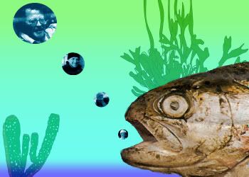
Now, I don't like unfinished business and I still had that sketch around my neck ( metaphorically of course) so I went to my Photoplus software and started thinking.... I scanned the ATC to retrieve the images, and started playing. I resisized and coloured the bubbles to give them coherence ( thanks for the suggestion Nancy), used a simple gradient fill to simulate the sea, and added a couple of images of seaweeds that I found by googling. Of course these also needed to have background removed and to be resized before I could use them. I left the image quite plain and simple. It certainly looks a lot cleaner than the physically collaged ATC above and I find it works quite well, what do you think.

Photobucket
Oh, you have probably noticed that I reversed the way the fish was facing. probably doesn't matter but by now I was sticking to the original sketch more closely. Even if the sponge wasn't there in the first place! The sponge and weed were made transparent to move them into the background. Don't you just love digital enhancements, so very versatile?

And the question? Do you ever use sketching to develop ideas for collages?
And the title? Blowing bubbles... or.... Living and Breathing Fisherman.


See you next time...........

Saturday 14 February 2009

Watercolour, landscape atc's

OK here are the two watercolour atc's which I mentioned in my last post. Difficult to believe that I have made four posts this week, but as I said in the first of these, last week was quite a prolific time for me. I was making atc's rather than surfing - or at least it seems like that was what happened. Well anyway, got to my art group meeting on Tuesday night and was determined to do some more watercolours. A little more involved than the last set although I am not sure that they have the naivity of that set. they are growing on me so I will let you see them anyway.


Photobucket
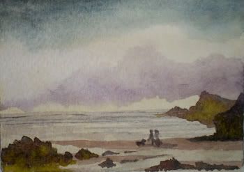
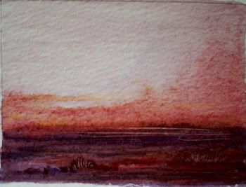
The first was a beachscene, really I was intending to do a skyscape but the cloud shadows did not turn out quite as I wanted them. But that is one of the problems with watercolour, and I haven't been doing much recently so control of the paint is a little haphazard. But a few rocks and a sandy beach seemed to have added a little and the couple walking their dog have managed to put the whole thing into perspective, I think. Whilst painting the figures I couldn't help thinking about the dog in Constables "Haywain". He is reputed to have painted the dog with five strokes of the brush, I don't think I have managed to copy him too badly, they look as if they could be distant figures to me, LOL. See my gallery for some more refined figures (beware they are unclothed - but in the best possible taste. And whilst there check out the portrait galleries , I really must cut down on the collaging and get down to some painting again.


Photobucket

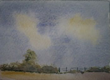
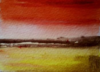
This is a very much more simple landscape. Running out of time - too much jaw-jaw and not enough painting - I quickly started another skyscape. Could have been a lot more aerial perspective in the sky to give the effect of the dome of the sky, but there you are; that is what happens when not concentrating. the line of the trees forming the field hedge and a little glimpse of the fencing give a point of focus to the landscape and finish off this little sketch. I am determined to do this every week now. Each week at my art group I intend to produce two or three paintings. Once I feel that I have found some of my old skill with the brushes I will vary this to do a few works in other media. One of my problems is that I do not focus enough on any one technique to really feel confident using any one medium. But hey ho, it's all grist to the mill - and I enjoy it; otherwise I wouldn't be doing it

Thanks for your perseverence and patience this week, back to normal next week.


Friday 13 February 2009

Squaring the circle with more ATC's.

I said I would post all the ATC's which I made last week and this is the last post, to complete the batch. Stangely, whilst I have been sitting at the keyboard this week I have not been making ATC's. Could there be a connection? I have actually done a couple of watercolours ( YEAH!!!) at my art group evening , but more of those in the next post.

The last of the 15 cards from last week have the floor... and here they are:-

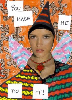
The first is a zetti atc, an area where I felt a little out of my comfort zone. I have done a few of these before but that was after following a small on-line course on doodling and it seemed to be a smooth transition to Zetti. This time was out of the blue, as a theme for the MAMMA challenge swap. But here was my entry.


Photobucket

The background was hand drawn ( doodled?) and coloured with sharpie markers. As was infact most of the rest of the card. The image was a found magazine image. The text was added because most of the zetti cards I looked at had trext on tehm somewhere, so I followed suit. I don't think I shall be doing many of these somehow. Addendum: Thanks to Nancy for swapping this atc with me for a great creation, knocked up just for the swap.
The next two were in the same vein as many of the atc's shown over the last two posts. That is, they are simple and a direct use of found magazine images.

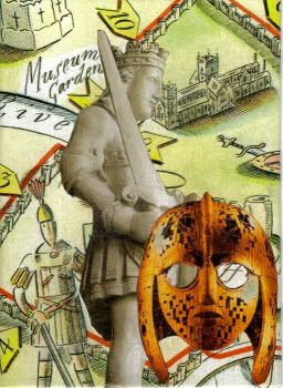
Photobucket
I stuggled with a title for this one. I found the map which I used for the background and thought it went well with the statue. I was originally going to make it a similar card to the KNIGHT card ( see previous post) using ADT. However something made me want to make it different, and this mask fell into my hands. It seemed a good idea at first but now I am not so sure.


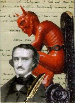
Photobucket

Here, I selected a background piece of text ( actually not POE) and played around with the juxtaposition of the portrait of Poe and the little devil image. I am actually quite pleased with this one. the quill ( a brass charm) was added as an afterthought to aadd a little detail.

The last two cards were created for another MAMMA challenge with the theme of HATS.


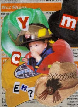
Photobucket

The first was titled, YMC... Eh? and not as some people seem to think CYM. Just goes to show what too much atc'ing can do to a persons ability to read good honest english, LOL... Anyway this was actually my second entry. I was thinking about how to make an entry with a masculine flavour, as a counter to the dozens of entries from all the women in the group. I found several images of headgear and the more I came across the more I thought of the old song by The Village People, YMCA. The image of the little fireman clinched it for me and I just had to go for a humerous card based on an allusion to the song.


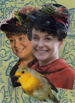
Photobucket

Now this one was my first hurried response to the theme. I found the ladies and the similarity of their grimaces just worked for me. I thought they were thinking, "What a thing to be wearing" and ready to burst out into laughter. The bird was purely to bring out the humour in the feathered headgear and has nothing to do witht he theme whatsoever apart from the fact that a number of his relations may have contributed to the making of the hats.

Right, I am now up to date and as I mentioned at the beginning of this post I will share my new watercolours next time, see you around.


Wednesday 11 February 2009

More ATC cards to beat the blues

As promised here is a further batch of the ATC's that I have made over the past week or so. As I said in the last post, creating these is a wonderful way to relax and forget the troubles which seem to be ganging up on me and my familly. Hope you like them.


Photobucket


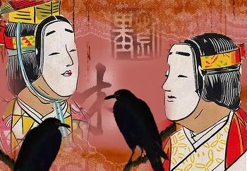
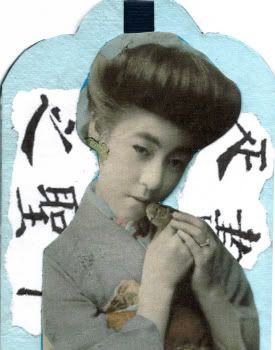
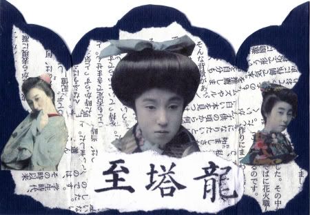
Another digital ATC, this one made for the Make It Mondays challenge with a theme of "Masks". I have tried with this one to rein in the amount of images which I have been putting into my digital cards. Just because I can does not in my opinion mean that I should, hope you agree. Sometimes simple is best, and certainly sufficient. This background is from the Flickr collage images group (Stars*Go*Blue), and the japanese actors from the same Flickr group ( Wackystuff)


Photobucket

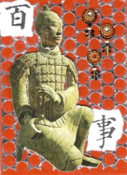
Here I used a plain red card, layered with scrap from sequin manufacture, or at least that is what I think that the silver foil with the holes in actually is. the image of the clay warrior is a found magazine image and the embellishments were bought at a local Charity shop. I believe that they are Indian.


Photobucket


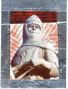
Another simple collage, Don't know why I used french text for the collaged background, but it is. The red card with black text is actually stamped and was a piece of offcut from another project (rule #1: never throw anything away). the image was again a found magazine image and I used aluminium duct tape, ADT, to frame the card. Final touch was the lines of indentations around the inner edge of the ADT.

Photobucket

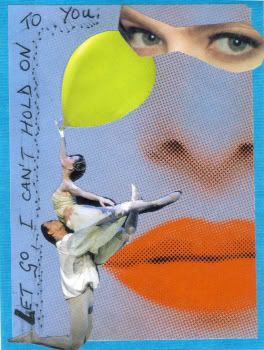
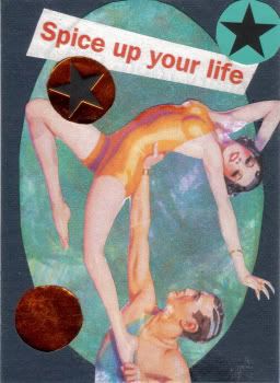
I found this background image ( the nose and lips) in an advertisement and immediately thought, " I have to use that". It struck me right away. I found the eyes and added them and then.... well I also had the dancers on hand and they sort of fitted in but I added the balloon and text to add a little humour. Don't tell me I have a quirky sense of humour - everyone does.


Photobucket


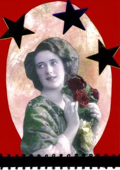
Now this is really down to simple. Nancy, thanks for the oval. I had the red card handy and it fitted so well with the oval scrap that I felt I had to use it. The colour of the flowers in the image sort of confirmed that I should use this, so down it went. What now? I added a little black ribbon ( also a gift ) and then the stars. they are gold and purple, metallic stars but the scan has not captured their "relecting appearance". I often photograph atc's with this sort of embellishment, but for some reason it got lumped together with the rest of the days output, sounds as if I have a production line!!!! maybe I will photgaph it and replace it at some stage, but don't hold your breath.
More atc's soon....

Tuesday 10 February 2009

A reason for creating ATC cards

Gosh where has the time gone? I have been beavering away creating atc's but don't seem to have managed to post them on my blog. I think that I will do this over the next three or four days so that I can share all of them with you and so that I don't overwhelm you.

Snow has been one problem, MIL is still in hospital and MOH had a little problem with another driver who tried to rip the side off our car - but what the heck? making atc's is a wondeful form of relaxation therapy.


Photobucket
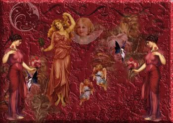
This a digitally created ATC, the theme for this card was, "Crimson" and it was entered into the Pocket Packet Challenge on Kim Newberg's PDA site a great place for some free to use images.


Photobucket


Photobucket

The next two have their titles on the cards. They were both made using mainly found images from magazines, something I seem to have gotten into recently. Don't know why but when I first started collaging I thought that this was cheating and not quite the thing to do. Of course, I know better now.

Photobucket


Photobucket

Thses represent a tritych that I made for a challenge for the MAMMA challenge swap, the first phot shows the front and the second shows the inside of the card.

Photobucket


This last atc again makes use of a found image from a magazine and uses an oval to show off the figures sent to me with a small package of goodies by Nancy, check out her wonderfully inspiring blog.
Well that's the first instalment, more tomorrow.

Sunday 1 February 2009

watercolour landscapes - semi-abstract

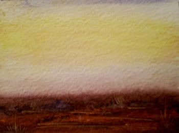
here I am again, doing something different. Read an article in a very old art magazine which inspired me to do some semi-abstract watercolours at my art group last week. I chose to work in an atc format for two reasons. 1) I could get more paintings finished in the two hours I had available and 2) I do love this small art format. And I can also get to swap them if anybody is willing. I decided to just use a couple of colours for each painting with a touch of a third.


here are the results:-


Photobucket
using cadmium yellow and a mix of red and burnt sienna

Photobucket
using alizarin crimson and ultramarine/burnt umber

Photobucket
using cadmium red and cadmium yellow/lemon yellow
All the paintings were done wet into wet and the colours were arranged to represent a sky/foreground showing a level horizon. I worked into the nearly dry work with a cocktail stick to add a little extra detail for interest. You can see larger versions of these photos on my flickr photostream http://www.flickr.com/photos/shadfan66/.
Actually I was quite pleased with myself. Not only because I like the paintings but also because it has been so long since I used my watercolours. I think I am ready to try a larger format next week. I will let you know how it goes.
ADDENDUM: the artist concerned who inspired the above paintings with his article in the May 2006 issue of "The Artist" magazine was Justin Cooke. Check out his site there are some great paintings.