Saturday 30 May 2009

I just gotta brag about this.

A little while ago I was approached by The Morning News, an on-line newspaper about using one of my photos on Flickr to illustrate an article. Of course I said yes............... It wasn't an art mag or even in an article about art BUT it was an offer to use the photo ( an ATC called Matrimony, I think my luck's in) but it was my first published work so how could I refuse.

I personally think it may have been the implied humour rather than artistic merit but who cares. It is my first official recognition.

See the article at The Morning News archives section.

Just a quickie this week still tied up with MIL's affairs (financial!) and down with a rotten cold, so no time to play with art/craft.

Sunday 24 May 2009

three new watercolour aceo / atc 's

Crafting has been a little slow of late due to family issues but I am still going to my art group every week and doing a little painting. In fact this week I did three little paintings (LOL). Hope you like them. they are all watercolour, my favourite medium and definitely the best for such small works of art.


Photobucket
This is not my usual subject although I would like to think my style is still apparent. I called this one, The North Wind Doth Blow. I have to confess this is copied (shock, horror) from an old issue of Leisure Painter magazine. It was done simply to practice the simplistic, impressionistic way of painting the figure in a stormy setting. In fact, I used the original as a reference and it is such a simple painting that it was difficult to put my own interpretation upon it. I would not normally condone direct copying but it was done for all the best reasons. The only problem is that I cannot give you the name of the original painter.


Photobucket


This painting was called, Poppies. Took me a long time to think of that title, LOL. The lighter marks in the foreground have been made with a cocktail stick before the paint was fully dry, I think this helps to bring the foreground towards the viewer and add a little depth to the painting.

Photobucket

The last of the three I called, Clouds. It could have been Trees or something similar but I made my mind up. Unfortunately, this painting has been scanned (in fact all three have been imaged in this manner) and the clouds are not seen properly. Should I have used my digital camera (see my previous post)? Well yes, but These were the paintings which raised the question posed in that posting and I haven't managed to take a decent photograph yet.

Sunday 17 May 2009

scanning versus photography of watercolours

A friend asked me what is the difference between scanning and photographing watercolours when I said I usually photographed my paintings. I do not know exactly what the technical answer should be, but here are a couple of examples of why I do just that.


If I scan the paintings, I often find that the scan does not adequately represent the colour variation in some of the washes, especially in the skies or high toned areas. I do not fully understand why this should be so but have assumed that it is something to do with the ability of the scanner to recognise as many colours / tones. Don't quote me however! If you have a better explanation I would love to hear it.


Photobucket


Photobucket

The above images have been scanned at full size (3.5 inch wide which equates to about 1200 pixels or thereabouts), and then reduced in size to 350pixels wide for inclusion in this post. The same two images photographed are shown below:-

Photobucket


Photobucket


I rest my case. The second set of images is far better, and more representative of the original watercolour. The paintings are photographed at 96 dpi to fill about 2/3 of the image finder using the macro setting on my run of the mill digital camera. These are cropped to the edges of the paintings which gives quite a large image compared to the scans. About 3-400 Kb compared to 150-200 Kb. I then reduce the size of the images to 350 pixels wide for inclusion in this post.

After explaining this it has struck me that the original photo image is quite large compared to the original scan image, could this be the reason why........? I will try to find some time to experiment with scanning at different sizes and see if I can improve upon the images. If I can it will be so much easier. Even tho I use a tripod to photograph paintings, I still have issues with focus, mmmm.... must see what I can do. Thanks for the question Nancy.

I will report back if I have anything significant to discuss.

a bevy of new atc's

The other day I felt at a loose end ( LOL) and decided to get down to a little crafting. The only problem was that my craft area was not available - don't ask !!! But I did have a growing stash of images and odds and ends including scraps of backing papers and my most often used tools handy ( scissors and glues). So I decided to use up some of this ever increasing pile of goodies. My thanks to all my swapping friends who may have contributed to this. I am very naughty not recording contributors but I tend to save them in a logically useful way and forget where they came from. Recent goodies have been sent from Renee, Constanza, Janet and Nancy amongst others, if I have forgotten to credit you please accept my apologies.

I guess that I am quite conservative in my use of materials and often print out downloaded images for specific challenges so I tend to put this wonderful stuff to one side thinking I will use that tomorrow - well tomorrow came yesterday!

Here is the result of going thru' that evenings crafting:-


Photobucket


Photobucket


Photobucket


Photobucket

The title of each atc is given by the text on that card. At the moment all of these are available to swap via my Flickr photostream. Or contact me via e-mail or a comment on this post.
Well there you have it. Four cards I feel quite happy with from from an evenings work. Something I always wonder about collage is. is it the images or is the way that they are put together and used. For example the last card..... this image of the little girl would look good in almost any situation. Add a background and a small item to complement the image, with a vaguely worded piece of text and you have an atc. BUT is it my skill in choosing and positioning the items or is it down to that beguiling image? Does it matter? I would love to hear your thoughts on this question in general, not necessarily on this card.

Saturday 16 May 2009

more atc's using coloured baby wipes

A recent challenge to make atc's from baby wipes coloured with watercolour in the manner of Bernie Berlin, had left me with several extra sheets of background paper which I decided to put to use. I was a little constrained because of a situation at home but found enough inspiration ( and scraps) to make the following two cards.


Photobucket


Photobucket

"Are you my mother?" and "I am very sweet" are both quite simple collages. The coloured baby wipe as a background, a main image and another to complement (the ribbon and the hand) and finally the text. I often wonder if I should put a lot more layers, images and other bits and pieces on my collages. I see many like that and often find them excellent, it worries me that mine are too simplistic. They are however in a similar style to many of my paintings - which I guess is me. Also, I was very pleased recently to be paid a compliment by Cathy about my collages where they were described as "clean and masculine". So perhaps I will carry on as I have been doing, and leave the decoration to the ladies.

Saturday 9 May 2009

two more watercolour aceo's

Well, came back from my art group with another couple of watercolour paintings this week. I have been posting one or two sketches using this medium of late and felt I needed to do something a little more specific. But as I am a little on the impatient side and wanted to complete a painting, it had to be aceo size (2.5X3.5 inches). In the event, I actually completed two. Still more sketchy than anything, they are both landscapes showing a sunset over distant hills with trees in the foreground to add a little detail. I was quite pleased with the foreground here, nice and loose.

Haven't yet titled them which is unusual for me but I have done a few sunsets recently and have run out of ideas. In fact as an afterthought they could well end up as, " sunset over distant hills 1 and 2". Well it is at least they are working titles.


Photobucket


Photobucket


One other thing I have been upto recently was to make another art doll (or button fairy)for a swap by Mamma on Flickr. My own take on this of course had to be different again ( see African art doll) and I ended up making an North American Indian art doll.I was actually too late for the swap as I was working towards the end of the week when it was the end of the month ( a friday)so I am stuck with it. Will have to hang it up with one or two others in my studio ( well loft space to my friends)LOL.

Photobucket


Well that brings me up to date on my art work, will have to go and start creating some more art - see you.

Thursday 7 May 2009

Using water colour to produce background papers

This is something I have done in many ways, often using wet-into-wet techniques to produce background papers for my atc's.

However, a challenge was set by MAMMA to use baby wipes ( the sort soaked in alcohol)to produce the papers. It gives a soft, almost cloth-like texture. It was actually taken from one of Bernie Berlin's techniques in her ATC Workshop so you might very well have seen it already. As an extra, we had to use words on the atc but that is by the by for this post. Here are the first two papers I made ... one is a soft, pastel shaded paper and the other is far more vibrant. The technique allows you to choose what you want to see.


Photobucket


Photobucket


The atc's I made from them are:-

Photobucket


Photobucket


I was quite pleased with the first ( operation get a man) but not so sure about the second. I think that I did not quite make the main images stand out enough from the background. (especially the crown which gets lost in this photo - only the three faux gems bring it out when seen close-up). Anyway I hope the recipients of these atc's are happy with them.

Sunday 3 May 2009

relaxing with zentangles

I don't know wether it is because I am an artist, but I find that doodling is so soothing. It can help you relax and can be done when under pressure, or simply just to pass the time. I do not do many Zentangles but I was at a loose end this week and had also agreed to swap a zentangle with an artist friend. SO...... here is the outcome. Couldn't decide which one I wanted to send so decided to send both. After all it's only art, and the recipient was pleased.


Photobucket
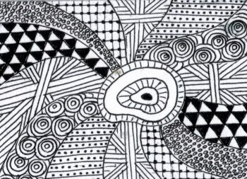
The first I called, " Spiral Galaxy"


Photobucket
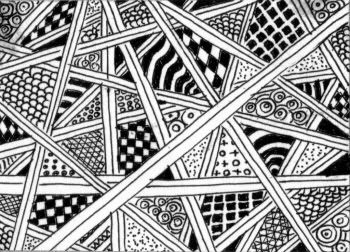
The second was called, " The Web"

Have to say I do enjoy these but they do take considerable time to finish, and often need more than one sitting. What I want to know is are the fantastic zentangles one sees on the web done free-hand. I can't seem to get the precision that I see in others work, anybody like to comment?


Just a quick posting today, will make up for it next time I promise - cheers


edit: BTW I have gone commercial, just reading up on Adsense and don't know what I have done but I seem to have got some Google adds on my postings. I have had a couple of adverts in the sidebar, etc for a while and was just tinkering with them - but I will let it stand and report on the income that this generates - so watch this space. I don't expect this will make me a millionaire overnight but fingers crossed, might be a few pennies in it. And talking of pennies I am hoping to start selling watercolours on Ebay / Etsy soon, will keep you informed about this also.