Sunday, 28 September 2008

OK it's back to the ATC's

Right, I thought I would crack on with another posting. This time a couple of ATC's which I have created since returning from my hols. Couldn't keep off them for too long despite the long face and loud sighs from my wife.

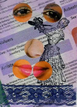
The first is for MAMMA's challenge swap ( the theme this week is "the phonebook"). Margaret keeps coming up with themes which on the face of it are quite simple but, they seem to provide more challenges than your average challenge theme. Or is it just me? Anyway, I came to this one late in the day due to last weeks holiday so didn't have too much time to think about it. I looked at the entrie so far and felt that a background from the phonebook would make a nice simple start. So far so good - look up a page with refernces to artists. Now.... I hit a snag. I find that where the background has some significance, I hesitate to cover it up. I stamped an image of a lady as a first step (simply because it was a new stamp!) but had difficulty following this up. Probably because she does not really have anything to do with either the phone book or artists on the face of it. So think..... and think again, maybe she was a model? I idly picked up a circle die cutter, and started browsing images.... the idea of the facial elements just popped into my head and hey presto. The title came as a follow up. Not what I had intended but hey, I go where the muse takes me.

Title:-Behind every great artist there is a great artists' model

Photobucket - Video and Image Hosting

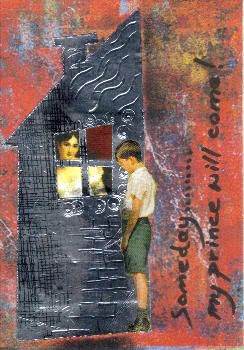
Right, number two. Now A good on-line friend and colleague has put together a collection of tutorials which she started for a private group on Yahoo, but has now made public via the "Six Inch Square" club on Flickr. I have tried to keep up with these and learn the techniques and incorporate them into my art work, but I really am following behind at a snails pace. Some time ago she posted a tutorial on using ADT (aluminium duct tape) to givea metal effect on atc's, etc. having only recently aquired some of the said tape, I was determined to have a go. Of course being me I didn't do as I was told but got the general idea and started playing around. I also had a set of templates from Dan (see the side bar) for his "wonky" houses. I layered some tape onto one of these templates and cut it out with a scalple, so far so good. I had in mind Lisa Vollraths latest MIM challenge ( door and windows) and so started searching for images to go behind the window. A small image of a lady was selected, and after a little souls searching and a failure to come across a suitable male picture (snappy dresser/prince even) I found this image of the boy - and just the right size to use too. The title "Someday my prince will come " was in mind but as I said above, when it feels right, go for it (well almost - in so many words anyway). I wrote the title at the RHS as a filler and to finish it all off. The background, BTW, was off the collage image group on Flickr - I must learn to take the originating artists name, for reference.

Photobucket - Video and Image Hosting


Saturday, 27 September 2008

Holiday in Lanzarote

I am breaking the mould with this post. Normally I only post images of my art work here but I have been asked if we took any pictures on our holiday in Lanzarote last week. Well, did we? I have never taken so many pictures within such a short time. The beaches, the hotel the volcanic landscape and the pretty inland villages were a magnet for the camera. And that's not to mention the tourist attractions like the Timanfayo national park, Le Jardin de Cactus or any number of sites with links to their world renowned artist Cesar Manrique.

So, here are just half-a-dozen images from a great holiday.


our hotel, the H10 Lanzarote Princess in Playa Blanca
Photobucket - Video and Image Hosting

The beach was only 300 metres away, we swam in the sea every afternoon
Photobucket - Video and Image Hosting


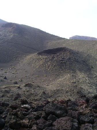
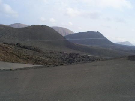
Volcanic landscape in the Timanfayo National park
Photobucket - Video and Image Hosting

the lava fields go on for mile after mile, an amazing site. In 1800's the last eruptions lasted over 10 years and covered almost half of the island with lava. Only one volcano is still active.
Photobucket - Video and Image Hosting


the village of Haria, showing palm trees, one of the greenest of the villages and the ever present volcanic peaks in the background
Photobucket - Video and Image Hosting


me in the sea at Playa Blanca
Photobucket - Video and Image Hosting

Both of us, putting up with the sun near the sea
Photobucket - Video and Image Hosting


So many pictures to choose from but I can't post them all, the above selection will have to do. I haven't included pictures of the caves formed by Lava Flow, La Cuevas Verde. Some 7 kms long althought only 2Kms are open to the public. There is a 500 seat auditorium in one of the chambers where they hold weekly concerts. No pictures of the wine growing areas, the vines are planted in large "holes" in the lava; dug to reach the soil. The tops are protected by stone walls so the lava doesn't get blown back in and these constructions go on for miles into the lower mountain slopes. No pictures of the cactus garden, they just wouldn't do it justice. No pictures of the contributions to the island by Cesar Manrique. The list of exceptions goes on, but enough is enough and it is back to crafting to meet a few deadlines. Next post will show the resulting works.

Wednesday, 17 September 2008

Losing the muse over an amusing card

Seem to be having a difficult time, creatively speaking....

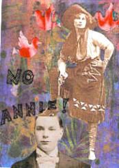
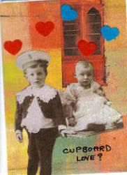
The latest theme for this month's NI lottery challenge was to "Make Me Laugh". Now most of my ATC's seem to include an element of humour without my being too conscious of the fact while I am making/creating the card, but setting out to make a humerous card had me stymied.

Well after lots of soul-searching I reckon that I have been thinking too much about the titles (trying to inject some humour?) and not enough about the visual elements in the collage. I certainly would normally almost have completed a card before deciding on a title. BUT because I am a sucker for punishment (and I did call this blog The trials and tribulations of........) I am going to post the inital results here. Three atc's with which I am not very pleased.

firstly, NO ANNIE (or I said under your thumb not gun)
Photobucket - Video and Image Hosting

next CUPBOARD LOVE (or all the nice girls love a sailor)
Photobucket - Video and Image Hosting

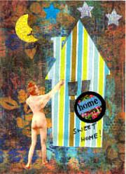
and finally HOME ( or I'll just pop inside and slip into something more comfortable)
Photobucket - Video and Image Hosting

Three very simple and straightforward collages. What's even worse is that I have used some great backgrounds and I don't like to use the same elements too many times.


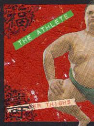
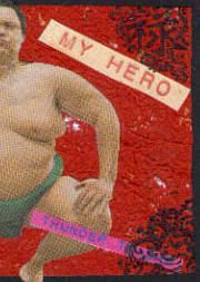
Before the winner (of the lottery was drawn) I came across a picture of a sumo wrestler quite serrendipitously, in a magazine and it gave me an idea. Of course now I wasn't thinking of the issue and was fairly relaxed. The picture was too big for an ATC but I decided the humour could be increased by cutting the image in two. I only needed a couple of bits of text and a set of four corner stamps that I happened to have and bingo!

Photobucket - Video and Image Hosting Photobucket - Video and Image Hosting

Sorry the two photos don't quite match up! I hope Margaret, the winner, likes this diptych. And I think I have learned quite a valuable lesson from all this. If it's visual art............ concentrate on the visual aspects before all else. And relax and enjoy yourself when working.
As an after thought, here is a link to a set of meditation exercises which you may find interesting. If you have never tried it, give it a go.

Sunday, 14 September 2008

ATC Kawaii challenge for MAMMA

Shucks this is even more embarrasing than the pictures of my workspace, I feel my artistic integrity has been compromised.


My good friend Margaret field on her Flickr group MAMMA, set a challenge for this week with the theme of KAWAII ! Most of the entrants had to google this term before even beginning and there was consternation in the ranks when we found out what it was all about. The accepted translation from the Japanese is CUTE! But it seems to be a concept that has taken over the psyche of the Japanese population, entertainment media and industry. It is one big movement. Anyway I went for cute and found some material to use. made my atc's ( always like to use my material up)and posted in the challenge site. despite my misgivings I am showing them here for your perusal. Hoping that you will not fall into the same trap.


Photobucket - Video and Image Hosting

Have a happy day!


The atc is very simple, an rectangular image has been layered to the Japanese naval ensign to form the edging. The text was already on the image and I simply added three brads in the shape of stars to finish off the design. Is this cute or what?


Photobucket - Video and Image Hosting

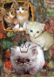
Pussies Galore (with apologies to the late author Ian Flemming)


Aaahhhh.... we all like cats, don't we? Unless like me you are a keen gardener with cats for neighbours! These three images were collaged on to a background from the collage image group on Flickr to give a pleasing composition and the big one was crowned by stamping.

Photobucket - Video and Image Hosting

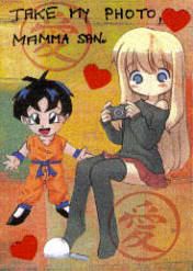
Take my photo Mamma san!


Giving a nod to the japanese style (anime?) images I put together this little scene. A couple of stampings and die-cut hearts used to complete the card.

Hoping to get back to reality next week, oh my aching head!

Monday, 8 September 2008

Orange themed atc's - Make it Mondays

Ok so passing swiftly on from the last post here are three atc's which I have made to a theme of orange - ever noticed when you start sifting thru your stash for something to fit a particular theme you have enough for many more than required - for the Make It Mondays challenge on Go Make Something Here are the three cards:-


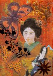
geisha = butterfly
Photobucket - Video and Image Hosting
The background is from the collage image group on Flickr ( it was the right colour) and the geisha image has been recoloured in photoplus, a free photo manipulation tool which does most everything which I want it to. I have Adobe Elements but am too lazy to load it and have to learn another interface.


When I think Geisha, I also think butterfly (but not necessarily first, LOL) so out came a couple of orange samples. the vine is printed on an acetate transparency and I have added a metal star in the lower right corner. The upper right corner is interesting in that it was a failed attempt at embossing. The pad must have been too dry or I had left it too long before covering in powder but the shape was only partially embossed. And you know what? I like it.


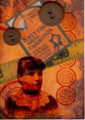
Knitting (or the knitting exhibition)
Photobucket - Video and Image Hosting

The background is from the same collage group on Flickr (again it was the right colour) . The main image is printed onto an acetate transparency (see below).


The stamping was done initially to liven up the background and having found and used a poster related to Knitting, the tape and buttons finished off the card rather nicely. Must say I am pleased with all of these, but the titles would not come for me. I think this is something to do with a challenge for the New Inspirations group on Yahoo, more below.


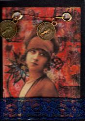
Pennies for your thoughts
Photobucket - Video and Image Hosting

Yet another background from the collage group on Flickr ( all together.... it was the right colour) and this image I know has been used extensively - I think I got it off art-e-zine.


The coins (?) were from a bead stall at a market in Bridgnorth wher we stayed for a couple of days back in the summer (yes we did have a summer, June 25th) and are fixed loosely onto a gold coloured wire. The ribbon at the bottom was for balance and to add a little contrast, although it also served to add a little modesty.


Two points I made above:-


1) I have had several requests as to where I got the acetate transparency. It is a standard product used for overhead presentation foils, the brand I am using at the moment is 3M's but I am sure that there must be many others. Get it from off the web or many larger stationers. BUT DO BE CAREFUL.................. IF YOU HAVE AN INK JET PRINTER, MAKE SURE THAT THE FOILS ARE SPECIALLY TREATED FOR USE WITH SUCH A PRINTER. Standard foils are for use with laser printers and will not take the ink from an ink jet. This could lead to a messy print out or at worst a printer mechanism needing to be cleaned out.


2) THe challenge I refer to here is, Make Me Laugh. Most of my atc's have an element of humour BUT I am finding it very difficult to actually produce a humerous card. But the worst part is It is affecting all my output. I never had to think about the humour it just came naturally but NOW....... It's like having crafters block. All I can say is thank heaven for the numerous challenge sites which are keeping me going with themes and subject matter.
Saturday, 6 September 2008

Ouch! This is embarassing

S5030694

I have been foolish enough to join a new club called the six-inch-square club. It is all about how messy some of us crafters can be in our work space (there must be some more who are willing to step forward even if they are not as bad as me) . The question is how do such great works of art come from such a messy space ( and I am so unbiased, LOL).


A view of my work table:- tools, glues, pens and pencils. the boxes at the rear left contain colouring pens, markers and paints (some) on the right the boxes contain six months worth of swaps which I haven't yet filed away (my excuse is I am still looking at them) and the orange biscuit box contains bits and bobs like ribbons and ephemera which I use regularly (more than once in the last six months). Currently working on a few cards which can be seen in the foreground.


Photobucket - Video and Image Hostingfind out more at Agnes the reds blog, where she will explain all.
If you visit my Flickr photostream you can see this photo with pop-up notes explaining what all the clutter actually is. And there is also a photo showing more of the surrounding environment and believe me it doesn't get any better.
Just one thing, I do not paint up there, I have more sense than that.

Wednesday, 3 September 2008

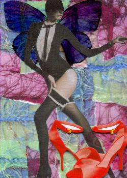
Kick off your shoes and dance


Photobucket - Video and Image Hosting
take off your shoes and dance; the title of my latst entry for the MAMMA challenge on MAggies Monday Musings (by Margaret Field) and the theme for this week is ANGELS. there have been some great interpretations of the theme and this is becoming a feature of this great new challenge/swap. Why not take a look.
This is another of those creations which just did not appear to work at first. I collaged the background from some downloaded photos of fancy threads, used a pair of transparent wings (printed on acetate) and finally found a use for the picture of this dancer (Margaret suggests she is a Dark Angel?) which I had taken from a magazine. And just in case you are wondering I believe it was one of the Sunday supplements! I didn't really think a great deal of it at this stage but I had a set of stick-on embellishments containing the red shoes and bingo they jumped out at me from a hiding place under my work table. Once I had decided to use them the title wrote itself (in a manner of speaking..... can anyone remember the song whose lyrics it appears in?).