I was at first unsure quite what to call this piece of art. I had been looking at art journals and thought that I would like to do something similar, so when I put this together with the serendipity squares technique which I had recently used, I came up with the idea of using more of my scaps and off-cuts to produce a series of collages to be contained in a book. I had a childrens hard back book approximately 7 X 6.5 inches and thought that this would give me a larger format than the ubiquitous ATC format to let my imagination and creative juices rip. The basic idea was simply to use the stack of spare bits and pieces to make the collages. It had worked well for the backgrounds and so why not for this project.
I soon found out. making a background is fine, but I was not so happy with the way that the collages were going. But that is jumping ahead, here are the front and back of the altered book. I called it my "Scrap Book Art".
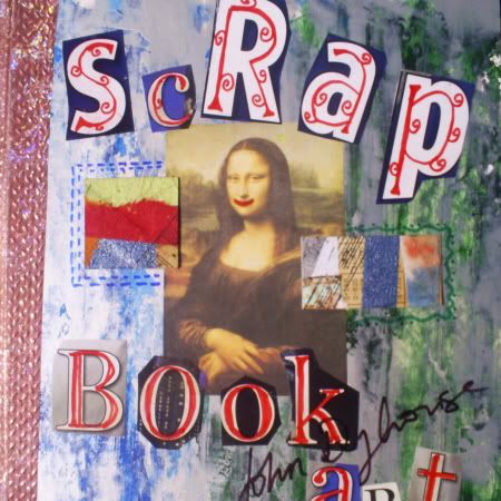
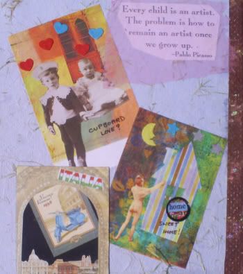
The front used a very famous image left over from a recent challenge and I utilised a couple of segments of the serendipity squares material. The back was simply a quote and three atc's which have languished in my finished tray for some time, with no sign of being traded. Waste not want not, heh!
I shall now show you a few pages, and then post the rest ( twenty images in all) over the next few posts.
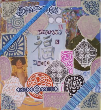
This was actually the second image I created but was on the reverse of the front cover, so I guess you would call it a frontispiece. Starting with the oriental script and the two images by Klimt, I layered lots of backing paper and then what were trial stampings, around these images to give me what I considered to be a pleasing composition. I later added the two blue ribbons to reinforce the diagonal structure of the page. Have you seen Father Christmas? There was little connecting the various elements except the colours and placements, it was an eclectic mixture of celtic, african and oriental images. The photo doesn't show it too well but the background circle for the upper celtic cross was a gold, metallic sweetie wrapper The last touch was to add the title using text cut from "The Radio Times".
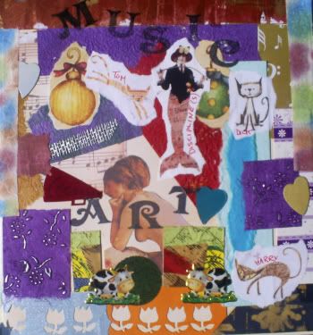
This was actually the first collage which I created. Lots to see, and again little connectivity between the images; just dipping in and sticking down. I thought it looked good when I first completed it but now I am not so sure. Again I have used a couple of pieces from the serendipity squares. Don't ask about the cows!! The title is stamped on this one, " MUSIC ART", I had thought that this would be a theme but soon changed tack.
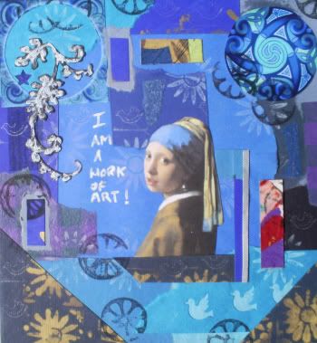
This was the fourth (the third will come next time) collage and I had decided that I was not getting what I wanted so tried to use a colour theme for the piece. Obviously, I hope, Blue. The central image is from a painting by Vemeer, again note the serendipity squares pieces ( 3 here, off-colour) and the circular stamping to bring a little unity into the composition. The title seemed obvious when I wrote it.....
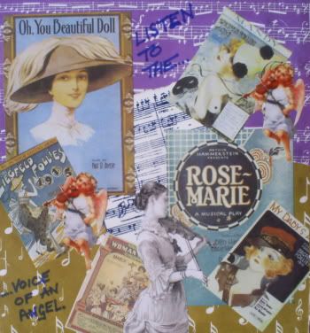
This one was to use a number of song sheet covers from samples by
Dover Publications, I was not happy at first and searched for some time until I found the cherubs and the female violinist ( which are also probably from Dover) which I thought finished off the composition nicely.
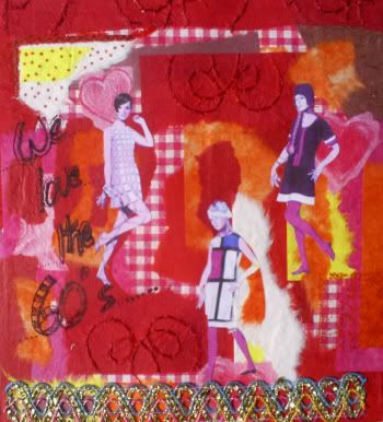
Ah...... red this time. A flaming passionate reminder of the sixties for me. I will say no more.
Will post the rest of the book pages over the next few days, see you around.


3 comments:
Some of these pages are amazing!
Thanks Paula.... that's about how I felt, SOME of them are good. I hope that as I progressed thru the book, the ratio of good to poor collages improved as I began to appreciate what I was actually doing.
It's such a beautiful work that I saw here. The way that you work is very interest and you give us many wonderful pieces of art, John! It's an unconscious force that you guide with a peculiar technique, could you see? Great job, John. It's a precious work.
Kisses!
Post a Comment