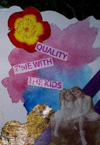
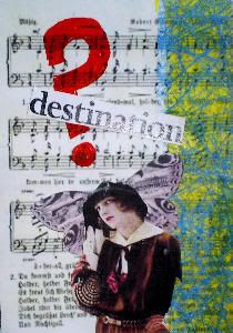
Hi, my first post on this new site was to say that I had found a new interest in collage. I have been experimenting with a few aceo's and thought that it was time that I included one or two on this blog. ( I have been trying to do one a day, and I find this so much easier than painting). Here are three I think are getting my juices running.
The first and second are made using a wet-int0-wet watercolour image as the background, I seem to be gravitating towards this as a starting point. I am also trying to keep the overall image quite simple with not too many additional items and for good measure using text to add a little humour (?). The last collage uses the ubiquitous wings to add a little whimsy.

I am tempted to colour in the dresses in this image to bring out the image a little more, I think that yellow / orange shades would give me what I need. OR perhaps I need to reprint the original image with a much higher contrast, and leave it as monochrome (keep with the style).


I am beginning to think that I may start to list one or two of these on ebay in the near future to see how they do at auction. As I intimated I am finding it far easier to turn out this sort of ACEO, maybe because a lot of the originality is simply finding items to add to the image rather than making the whole image up. I am still feeling my way somewhat and feel that I need to understand all the ramifications of technique but I will definitely be doing more and will keep you posted.
If you have any constructive comments, I would love to hear from you as this is so new to me and I am stepping into the dark.


2 comments:
Hi John, the comment didn't work last time, so will try and remember what I said.
The third one REALLY works well. I agree with you about the wings should be lower, but otherwise a perfect collage. You're definitely getting the hand of it. Addictive isn't it.
With The second one, the only thing I would alter is the fringing at the top. It doesn't have to be cut perfectly, just suggesting the irregularity of the fringing.
I only ever use scissors, and I try to cut out just very slightly inside the image. This usually gets rid of unsightly edges.
I can see by your work that you are enjoying yourself.
Keep going.
Thanks Margaret, I appreciate your criticism and advice.
Post a Comment