I made a specific decision to get away from digital this week. Although I have found out how to use one or two new tools in my photoplus 6.0, but more of that in my next post.
Yes, this week I have made a few real physical, collaged atc's; and in so doing have rediscovered a yen for the simple life. You know... a background, a main image and ................. little else!
Take this first example...........
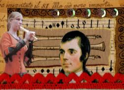
I have called this, " ...and the music turned his head". Another of those scraps of material which I used recently, I knew I could make use of them when I found them in a craft shop. I found the girl's image and thought it was just what I needed for this one. But she did look lonely so when I saw Robbie Burns, I knew just what to do with him. Couldn't quite get away from thinking it necessary to add a few embellishments at this stage, so out came the red, lacy edging and a few little sequins ( have I ever used them before? Never!). At this point I managed to consider it finished. One of the problems with this atc was I didn't want to cover the background - seemed a shame!
But........ I could be even more basic..........
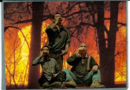
This I called, " the hottest fire in the world, probably". With apologies to a famous lager advert!
I was actually trying to make an atc with a theme of fire ... well, I suppose it sort of worked out this way, but the images of the drinkers sort of took over. Found them in a magazine and decided that I could make a better composition with them than the photographer. I think I shortened the standing guy just a little too much, in hindsight.
and then.....
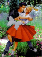
"This is where I planted my petunias". Originally cut these dancers from the same magazine, to use against the fire background. You can imagine the sort of title I was working on. But loas, they did not give enough contrast, oh for a little tweak with the digital toolbox! Anyway, I came across this garden scene and quickly changed my mind. Problem..... and I have come up against this before. When glueing flimsy images, do not use glue sticks! I lost the girls pony tail ( stuck on separately) and his nose, did you notice? I also lost a little of his torso, hence the butterfly; at least it does sort of fit in. It was actually a die-cut shape from an aluminium drinks can. Needs a little bit of pressure but it does work without damaging the cutter too much.
The last two were made using a background paper recycled from a smal gift bag. When I saw it I loved the images, but found it difficult to cover them up again.
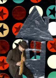
The first, "this ole house..... rocks" resulted from a desire to match the main image with the modern looking background image. A jazz musician! I put the ADT tape house in because again I thought the shiny look felt quite modern (although it doesn't look too shiny in this image). Don't ask me why a rock and roll song title came into my head as a foil for the jazz musician.
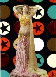
Now, can you get any more simple than this? A slightly off centre image (oh yes it is!) on the same recycled background. AND why not a modern image? Just wanted to use this dancer .... again. Do I need a good reason for everything, I am an artist! Just couldn't find it in my heart to cover the background up any more than I already had. I do still have a few scraps of this paper left so look out for it in future atc's, LOL.




5 comments:
I am soo with you with the background thing John. Sometimes I can hardly bear to cover it. And yes, the pritt sticks .... been there, done that. Great ATCs.
I really dig the jazz art!
keep it flowing!
Me too John, I usually really struggle with the backgrounds - in that I don't want to lose too much of it - especially if it's one I've made myself.
Sometimes simple is best I think - all your ATCs look very effective (love the composition of the fire one).
Just one thing worries me - what Margaret will say when she sees you've used some red lace!
I really like " ...and the music turned his head". And that fire scene is pretty neat. I love being an artist and not having to explain why you did something. Unless of course a non-artist family member asks why did you do that and they don't understand when you tell them because I wanted to. Keep up the great work!
John I just love your sense of humor in your Art. I too always fight with the background it seems we cover so much up and I love seeing the background. I like all your cards, enjoy reading how you came to put them together. So many individuals that visit our blogs are always curious to know how did you do that? It is nice to share, a fellow artist after my own heart.
Post a Comment