atc's for relaxation
I have been pretty busy of late with one thing and another and so I decided to do some very simple ATC's just to loosen up. As with all things, simple does not have to mean that a created item cannot be satisfying.
Here are four ATC's made over the last couple of days:-

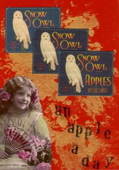
This one I called, "an apple a day", I was challenged to make an atc with a bird, a face and some text. I had a bckground scrap which I had used to blot up some unused gold, acrylic paint from the jigsaws. I found three of the snow owl apple adverts and arranged them pleasingly together with the image of the young girl. The title came quite naturally and I stamped the text onto the card. very simple and once I had decided on the images very quick.

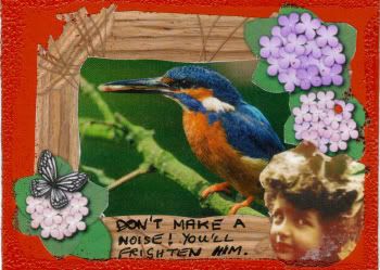
This ATC was for the same challenge. I had spent a little time searching for the images and so decided to make another card.the photograph of the jay fitted well with a frame that I had in my stash and having placed the face on the frame again the text ( and hence the title) just popped out at me. this time I used handwritten text. The title? "Don't make a noise".


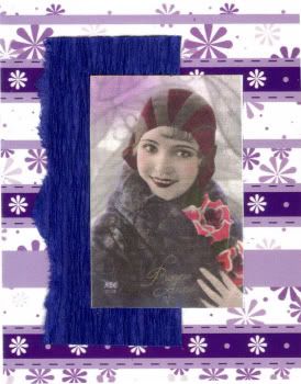
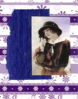
These twocame from some cardstock which I was sent along with a swap. (Thanks Tina) As I was making a card to fit the theme "purple" for a challenge on Lisa Vollrath's Make it Mondays I decided to use this as the background.
Lisa also has a section on composition/layout templates which I must admit that as an artist, I did not really think I needed. But having seen them and looking for something simple I decided to use one for this card. But being me I had to mess with the template and ended up doing two of this particular design, with a small piece of blue paper and an image of slightly different sizes. the blue paper was torn on one edge to offset the lines of the background card.
I was really surprised at the difference a couple of small changes made to the effect of the template. They obviously look very similar but the first one I think has the edge because of the relative sizes of the shapes. I simply called these "composition1a" and "composition1b".
Off to make a few more cards.............. back soon with more photos.


No comments:
Post a Comment